 |
It all began with an ellipse.
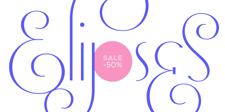
Like an artist who goes from a pictorical logic to a more abstract one, in Elipses geometry is stripped of any distractive or ornamental detail. The font is naked and it shows that it does not need complex shapes or decisions in order to be very attractive.
The font is a compendium of ellipses and stems, with a didone 'pensiero'. It also gets some inspiration from the art-deco letters and architecture, due to obvious reasons. Geometry at its best.
Elipses will be useful for magazines, books, ads, or any piece of design that needs elegant letters.
Note about the styles
The styles named "Alt" (from Alternative) have their swashes with less loops. Use them if you are more into naked geometry.
Apart from many alternates and ligatures, I've included some different sized glyphs in all the styles so you can also play on the rhythm!
Have fun!